Sunday 30 November 2014

Cornelia Parker and Erdem

Cornelia Parker

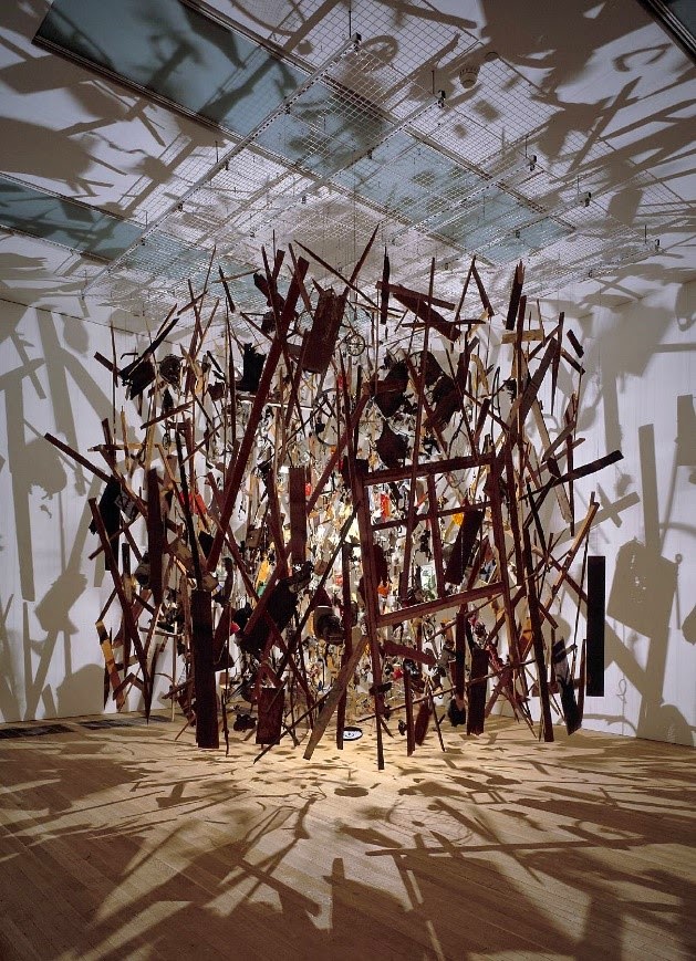
When looking for artists that had used some form of deconstructing within their work I couldn’t find a better example than Cornelia Parkers Exploding Shed piece. The shed was literally blown up by the British Army with the remaining pieces then arranged to hang from the ceiling of the gallery the piece was exhibited in. I love the way that the piece has been lit up by a single spotlight as the remaining fragments of the shed create such an interesting shadow on the walls, floor and ceiling that they add another dimension for the viewer.
 
 
I like the contrast between the two pieces as Exploding Shed was purposely deconstructed by Cornelia Parker to make the piece whereas Hanging Fire, was made using salvaged material from a suspected arson attack. I like the idea of constructing a piece of art from what would ordinarily be rubbish lying around on the ground. The formation of the pieces of wood is also interesting as it almost links in with it in its original form of the building before it was burnt down. As Cornelia Parkers work is showing deconstruction from an art point of view I would like to focus on a fashion collection that uses elements of the theme.
 

Erdem

When looking for words associated with deconstruction one of the more obvious ones was cut. From a fashion point of view laser cutting is often used to create  detailing and I found a lot of it used in Erdem’s Autumn/Winter 2014/2015 collection. I really like the intricate detailing that feature on these dresses as they create such beautiful effects. The cut outs make the design of the dresses change from what are fairly simple cream dresses to something that looks like proper high end fashion.
 
I love the concertina neck detailing on the dress on the left as it is so sharp and structure that it is at odds with the scalloped edging along the bottom of it and the actual shape of the cutout. The idea of constructing this kind of ruffled shape is something I would like to work with myself as I think it adds a 3 dimensional edge to what is otherwise a fairly flat garment. Both garments are total contrasts to the Comme De Garcons pieces as the Erdem dresses are beautiful but totally wearable whereas the others were too outlandish to be worn on a day to day basis.


Comme de Garcons and Elizabeth Ashdown

Conme De Garcons

When looking for artists and designers that linked to the deconstruct and construct theme I found Comme de Garcons. This is a Japanese fashion label founded in 1969 by designer Rei Kawakubo and her husband. Much of the labels work has strong links to the theme of Deconstruct and Construct, especially their current Autumn/Winter 2014/2015 collection. The two outfits I have chosen from this collection have clear areas where the fabric has been deconstructed such as the skirt on the left which looks like the material has been torn and layered up to create a textured look.
 
 
I also like the structure of both outfits, particularly the skirt on the right as it almost looms like it has been woven to create the angular shape. These shapes demonstrate the construct element of the theme really well and having experimented with weaving in some of my samples I find it an extremely interesting method of construction which I would like to develop further. To start this off I have looked for an artist that uses weaving instead of a fashion designer and found Elizabeth Ashdown as this allows me to approach the project from a non-fashion point of view. I love the impracticality of Comme De Garcons clothes as they are not your average ready to wear garments and offer something much more closer to art.

Elizabeth Ashdown


Elizabeth Ashdown is a London based British textile designer who creates woven textiles for both fashion and interiors. Her work is bold, bright and colourful and has a great mix of thick tubular pieces of cord woven in with thin little strands of yarn to create the most beautiful works. Each piece is like nothing I have ever seen before and I love the use of colour and materials as each has great contrasts with the other. Elizabeth Ashdown uses the method of passementerie which is the art of using braids, beads and cords to create trimmings and edgings. It is an extremely intricate way of working and as each piece is made by hand it is easy to see time consuming they must be to create.
 
 If I was to try something like this myself I would have to simplify it a lot but I think as a source of inspiration the work is incredible as it shows just how much can be done within woven textiles, an area I haven’t really studied before. The pieces also lend themselves to another word that ties into the idea of layering within construction as depending on where you view the piece from you will see something totally different, from colours and shapes to the materials used and this is an extremely interesting concept.


Exploratory Stage Evaluation

The exploratory stage of the Foundation has been incredibly useful to me as it has taught me so many new skills that I can take forward to the pathway stage. Many of the things that I have done has changed the way I work, from working in my first sketchbook, to making grounds to work on and quick continuous line drawings. As a result my working process has become much quicker and I now don’t spend as much time trying to take every piece through to a completed piece of work, I simply develop certain areas that work. An example of this is the barcode piece where the fairly average drawings were developed and pushed further to create a final piece that I never would have thought of had I not gone through the process behind it.

The first taster session in visual communications allowed me to learn more about the different areas involved like illustration, animation and graphic design. There is a lot more to each of the disciplines than I would have previously thought as I believed that much of the work done in visual communications would be done digitally so finding out that much of the work is hand rendered was a nice surprise as this is the kind of work I am used to doing myself. Researching the work of Noma Bar and Olivier Kugler was a good source of inspiration as they are both so different in style yet work under the same title of visual communications so are great examples of the wide range of work that can be done and also acted as a source of inspiration for some of my pieces. I was also able to transfer the line drawing skills into drawing typography which was a really interesting part of the week. I have never looked at typefaces as something to draw before but now I see type everywhere which is something I’ve never noticed before.

The week spent in the 3D taster was really enjoyable as the activities we did were informative yet entertaining at the same time. Most of the 3D work I have done before has been ceramic or garment based rather than made in paper so this was a totally new experience. The task where we had to feel inside a bag and describe it to another person encouraged us to visualise things in our heads and allowed me to communicate my ideas through something other than drawing it out. This was quite difficult but made me feel as though I had become better at explaining myself and ideas I have verbally which is always helpful for group projects. The last day that we spent in the silver smithing studio was my favourite as I learnt so much in an incredibly practical and hands on environment. I was really happy with the piece I made as it was so spontaneously done that I don’t think it would have the same effect if I had planned it out beforehand.

The week spent in fashion made use of skills from other weeks, like the colour barcode I did in the river project as the swatches I made from the stimuli image related to this. All of the garments that I have made previous have been from fabric, with only small elements being tested in paper beforehand so to make a fully wearable piece from paper was a new experience. I enjoyed the challenge of making something that could be worn in a variety of ways but still wasn’t a typical garment and I feel that the piece I made had strong links to the original image I looked at. I would have liked to have experienced more of textiles as opposed to mainly fashion as I have always done fashion and known that I wanted to specialise in it so to experiment with something else in as much might have changed my mind. However as it stands I enjoyed the taster so much that I do not want to change my mind from specialising in fashion as it is still something I wish to pursue. Researching fashion designers and textiles artists was very helpful as it gave me so much inspiration for ways of working that I can take forward with me to my specialism stage.

The fine art and photography taster week had quite strong links to fashion as the photos that I took to start with to then change into tactile imagery can be used for other things such as developing prints. I enjoyed the creative process in this week as it showed me how to push a piece further and further until by the end of the week I had made tactile images, 3D paper pieces and a 2D drawings all from the same photograph. The research that I did in this stage was also helpful as the work of Noriko Ambe and Zadok Ben-David was so different in the process with one being hand carved from paper and the other being lasercut from metal yet both ended up being slightly similar. The freedom within fine art is an interesting concept but for me I prefer more of a structure to the way I work.

Although I enjoyed each week thoroughly I still haven’t changed my mind from wanting to study fashion. I hope to improve and build upon skills I have already learnt like observational drawing, experimentation and idea development as well as continuing to work in a sketchbook. I hope to move away from the work that I have done at A-level which was quite rigid in the sense that artists were merely researched and imitated rather than being used to inspire which is what I would like to now do alongside my own ideas.
Tuesday 18 November 2014

Fine Art and Photography

The Fine Art and Photography taster week was a great example of how far the creative process can go with a piece. The final pieces that I ended up with at the end of the week were totally different to what I had thought I might make during the week and I was pleased with the outcome. We started off with photography and were sent out to capture various images of interest, with the intention of turning them into tactile images. I enjoyed finding things to take photographs of as it made me so much more aware of the environment I was in and things that I ordinarily would not have paid attention to suddenly became so much more exciting.
The back of a moved ceiling tile
A door with several different textures
From there I selected two black and white photos that had different surfaces and textures to which I could apply other media onto. Making the photographs tactile was a great way of experimenting with media and totally changed the way that they looked. I selected media that would represent the textures of various areas of the image, for example scrunched up tissue paper with string sewn in to represent the insulation in the ceiling and the metal around for the first one and plastic sheeting and electrical tape to represent the smooth edge of the door and the reflective panel of glass in it. I was quite pleased with the overall effect of the images as the changes were quite bold and made a big difference to the photos.
 
The two finished pieces of tactile imagery
The next step was to photocopy the images of my work and turn them into something 3D through various methods like cutting, folding and tearing. These pieces were to be the basis of a final piece made from A1 cartridge paper and to find methods that worked I experimented with various techniques. The first two pieces were tubular shapes that I cut into in two different ways to create different effects. I particularly like the shape of these pieces and I think that they are quite interesting as stand alone pieces. The second two pieces I decided to use folding on and I think that this worked really well as it made them a lot more 3 dimensional. For the final piece I decided to use parts of all of these pieces as I think that both the folded and tubular pieces worked well.


The final stage of the week was the A1 piece which I really enjoyed making. All of the paper work I had done previously had been quite small so the chance to experiment with a large piece was a nice change. I created a tubular shape from a piece of the paper and wrapped around the remaining paper which I had folded into a concertina type shape. This made a really interesting final piece which helped me to make a piece follow the transition from 2D to 3D which isn't something that I had done before. I really enjoyed this week as each stage provided a new challenge and a different way of working which resulted in some really interesting pieces. Even if I don't choose to pursue Fine Art or Photography I learnt skills which I can take forward into new areas.


Issey Miyake

The work of Issey Miyake is not like many other fashion designers that I have looked at as his work is so bold with such strong geometric shapes that it can almost be considered as art rather than fashion. The lines he uses make such interesting shapes that some of his designs don't resemble traditional garments at all but are still fully wearable. An example of this is the Spring/Summer 1995 collection where the shaping of the dresses looked so solid that they almost didn't look as though they were still made from fabric. Even in the second photo where the dress is not worn by anyone it still looks so beautiful it can be viewed and appreciated as a standalone piece, proving that fashion design doesn't always have to be about creating something that can be worn everyday.


I particularly like Issey Miyake's work from his Pleats Please label as the methods of pleating he has been experimenting with over the years give many of the garments such beautiful contrasts. This image below is from a page in the Pleats Please catalogue and is a perfect example of the contrast between bold geometric lines and the softness the pleats add to the fabric. I also like how the pieces from above and these here show the same aesthetic of Miyake's design work whilst being total opposites in the sense that one is so high fashion and the other can be worn in everyday life.

After looking at type in Visual Communications and understanding more about different typefaces I particularly liked this range from the collection as it shows how type can be used within fashion. Having worked with type blocks and printing inks before I really like how that same effect has been recreated on these garments but on such a large scale that the print doesn't just look like a random placing of letters. The monochrome colour scheme could be quite plain on some garments but on these it works so well as where the type overlaps the colour is darker with solid black trims on the base to balance out the white background.

Wednesday 5 November 2014

Noriko Ambe

After spending so much time I the taster weeks working with paper it was nice to research an actual artist who uses paper in their work. Most of the paper pieces that I have seen previously has been cut into or folded but this is the first time I have seen paper work where the cut outs form an indented like shape. The number of layers in each piece must be huge and to get the shape required each one must be cut with such precision so that when stacked up they form the right shape.

 
The overall effect of each piece looks clean and neat and when all together the individual sheets create such a solid shape that it is hard to believe that they have been made from paper.  For each piece to be cut by hand the amount of time that they must take is immense and I think they are very beautiful to look at as well as being skilfully made.
 

As well as stacks of paper, Ambe also uses books of work by other artists and it is this idea of reworking an already existing piece of art into a new one that I like as it gives the work a new level of interest. Each book can take months to complete with the amount of cutting and reworking that is done as none of the designs for the cutting is a purely random pattern. Noriko Ambe tries to get a feel for the contents of the book and lets this translate though the way she cuts into it so that the original source material is not lost.


Zadok Ben-David

During the Fine Art taster week I decided to look at an artist who worked in a medium that I had researched before but was totally different. Zadok Ben-David's installation Blackfield is such an eye catching piece and the way that the view changes depending on where the viewer is stood is extremely interesting.  In comparison to Junko Mori's pieces which are worked by hand before being forged together, the metal in Blackfield has been cut out so delicately that each piece looks almost organic and the due to the sheer volume of them they actually look like a field when viewed as a whole. 


Each individual piece looks so fragile that it is hard to believe that something as solid as steel has been used to make them as they don’t look strong enough. More than 12,000 individual pieces of steel were used and although they ended up in 3D they were originally images from Victorian text books of that Ben-David copied out and cut from steel. I think this adds another level of interest to the piece as it has changed from a flat 2D illustration into 3D and isn’t based on real life natural form.
 
 
Each of the pieces has been hand painted on one side so that as the viewer circles around the piece the field looks black at one angle and suddenly becomes filled with colour at another. This illusion like concept makes the piece look so beautiful from whichever angle it is viewed at that it is easy to see why smaller pieces in Perspex boxes with mirrored panels have been made to sell as the piece has such aesthetic qualities it can be used as a decorative feature as well as a piece of art.
 
 
When looking at the piece one of the things that becomes obvious is the amount of time and level of precision that was there during each stage of the production, from sourcing the images from the books, to cutting them into the flower shapes and painting them to placing them in the sand so that each colour is in a certain place in the overall piece.