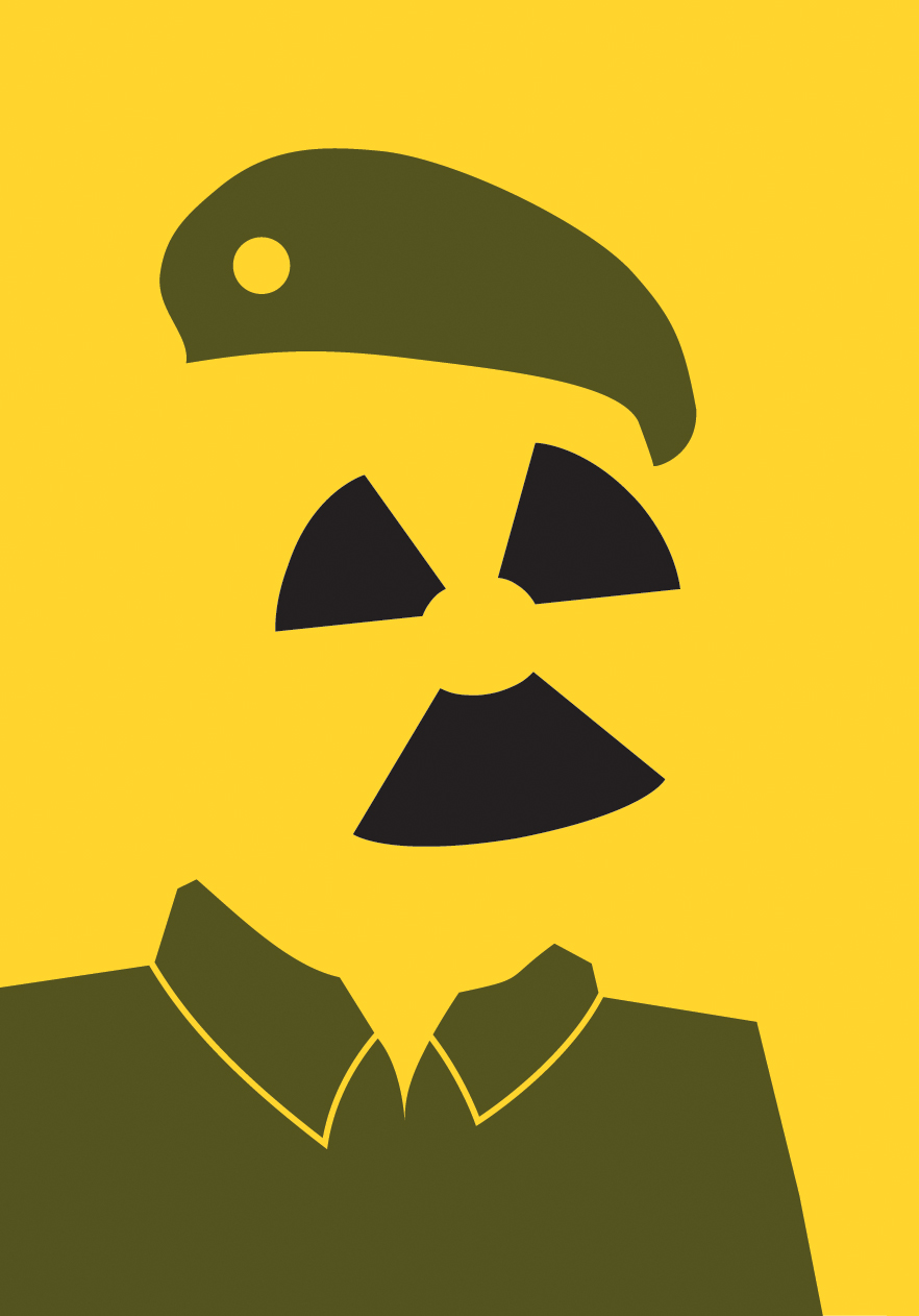
After learning about how important the quality of line is in visual communications I found Noma Bar's work to be of great interest as each line is so carefully considered that the finished piece of work doesn't just show one image it shows two. Working in line is totally new for me as I am used to doing work that is much more tonal than linear so to look at an artist like Noma Bar who uses only two or three blocks of flat colours has shown me a way of working that I never would have previously considered. Another new concept for me is the idea of negative space which has been used to show multiple images. A lot of the work I have done previously has filled in all blank space but I now know that a piece can be even more effective if the negative space is considered as much as the image itself. Noma Bar's pieces are almost like optical illusions in the sense that you have to look at them more than once in order to see both sides and I think this holds a lot of interest for the viewer and is what places them amongst some of my favourite graphic design work.


No comments:
Post a Comment